
The human soul is a complicated thing. It is vast, turbulent, and capable of feeling seven different types of “anxiety” before breakfast.
We were a species forced to navigate the treacherous waters of tone using nothing but punctuation. A period meant you were angry. An exclamation point meant you were shouting.
And if you wanted to simply show joy? You had to resort to digital gymnastics. You had to type a colon, a dash, and a bracket, and hope the other person tilted their head 90 degrees to the left just to see you smile “:-)”.
It wasn’t just texting; it was neck yoga.
We were emotionally constipated by ASCII text. We were Shakespearean actors forced to speak like fax machines. We needed a new language. But we didn’t get a new dictionary. We didn’t get a new alphabet.
What we actually got was a grid: 12 pixels high, 12 pixels wide (the tiny canvas Kurita used for DoCoMo’s first emoji set).
It seems impossible, doesn’t it? That you could take so much of human feeling, from joy and heartbreak to sarcasm and that specific feeling of “yikes,” and compress it into a space smaller than a breadcrumb.
But one designer saw the potential in those 144 dots.
Meet Shigetaka Kurita, the Japanese designer behind the first widely used mobile emoji set.
The “Prequel”: The Great Heart Revolt of 1995
But Kurita did not just guess that we needed emojis. He had proof. He had seen the Pocket Bell Revolution (I’ll explain what that is).
Rewind to 1995. Windows 95 had just launched, the internet was waking up, and in Japan, the Pocket Bell (or pokeberu) had become a national obsession.
If you’ve never seen one (don’t worry, I can explain), think of it as a primitive tweet machine. You punched in numbers on a landline, and they appeared on your friend’s tiny screen. It was texting, if texting required a codebook, a quarter for the payphone, and infinite patience.
The Pocket Bell had a secret weapon: a tiny, pixelated heart symbol you could send along with your numeric message.

That little heart did a lot of heavy lifting. It softened blunt messages. It added warmth. It let people say, “I care,” without adding a single extra word.
Then DoCoMo made a choice that seemed sensible on paper.
Aiming to make their pagers more “business-friendly” for a corporate audience, they released a new model that prioritized professional characters over the heart symbol. After all, serious business people didn’t need to send hearts, right?
The result? An unexpected exodus.
The user base did not just shrug; thousands of them switched to competitors whose devices still had the heart. DoCoMo lost a generation of users simply because they underestimated how much that tiny symbol mattered.
Kurita and his colleagues watched this unfold. Kurita realised something important: People did not only want to send information. They wanted to send emotion.
The 12-Pixel Solution
Fast forward to 1999. NTT DoCoMo was preparing to launch “i-mode,” a mobile internet service that promised the future. But the ghost of the Heart Revolt still haunted the hallways. They knew that if they launched another device without a soul, the teenagers would riot.
Shigetaka Kurita was tasked with the solution. His canvas? A digital grid of 12 pixels by 12 pixels.
That is 144 dots. To put that in perspective, a single icon on your iPhone today has more detail than Kurita’s entire portfolio. He wasn’t just designing; he was playing Tetris with human emotion.
He grabbed a pencil and paper and started adopting tricks from the masters of visual shorthand: Manga artists.
- In manga, you don’t write “I am nervous”; you draw a giant sweat drop on the forehead.
- You don’t write “I have a bright idea”; you draw a lightbulb.
In just one month, Kurita sketched the original 176 emojis. He gave us suns, snowmen, trains, and, crucially, he returned the heart to its rightful throne.
But here is the best part: Kurita wasn’t a graphic designer. He was an economics major. He fully expected the “grown-ups” at tech giants like Panasonic and Fujitsu to take his rough doodles and turn them into professional, polished art.
They didn’t.
Whether out of laziness or a tight deadline, the manufacturers took one look at his rough, pixelated sketches and essentially said, “Eh, looks fine. Ship it.”
And that “accident” was the best thing that could have happened.
If a committee of professional designers had “fixed” them in 1999, we likely would have ended up with something glossy, corporate, and soulless.
Instead, because they shipped Kurita’s raw sketches, the icons felt alive. They were jagged, simple, and wonderfully unpolished. And let’s be honest. That scruffy charm captures the messiness of real human emotions way better than a glossy, corporate logo ever could. They were perfectly imperfect.
Yes, those are the original 176 pixel masterpieces! Details on how I built this are at the end of the post.
The Legacy: From “Neck Yoga” to High Art
It is easy to dismiss emojis as silly. But Kurita didn’t kill language; he resurrected tone.
He gave us emotional punctuation. He gave us the ability to soften a rejection with a flower 🌸 or scream without making a sound 😱.
Today, Shigetaka Kurita’s original 176 emoji designs aren’t just on your phone; they’re in the Museum of Modern Art (MoMA) in New York City. Every platform has since redrawn and expanded its own emoji set, but they all trace their lineage back to Kurita’s tiny 12×12 originals.
And they belong there.
So the next time you send a ✨sparkle✨ to your best friend, remember the Pocket Bell. Remember the teenagers who refused to give up their tiny pixelated heart. And remember the man who realised that sometimes, when words fall short, a handful of pixels can still say, I get you.
🤖 Behind the Code: How I Built the Confetti
FYI for the fellow builders out there: Reading about emotions is one thing, but feeling them is another. To pay homage to the Architect of Emotion, I hacked the grid so you can interact with his original masterpieces.
To make that confetti button work, I took the original image of Shigetaka Kurita’s 176 emojis shown here:
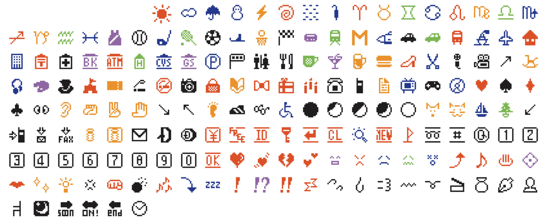
Shigetaka Kurita, Original Emoji Set (1998–99). Image courtesy of MoMA.org.
Then, I wrote a custom Python script to slice the grid and extract each 12×12 icon into its own individual PNG. I then built the confetti block using Telex.
If you are curious about the python script, or the Telex plugin, or just want to nerd out about image processing, you can Reach out. I’d love to share the code!
Leave a Reply