
They say you should never look back, but when it comes to the internet, I disagree.
I recently decided to play digital archaeologist. I didn’t just look at pictures on Google; I actually grabbed the official WordPress 0.71-gold release files from WordPress.org (link here) and decided to resurrect them.
I fired up Docker and had a few hair-pulling moments, but… it worked. Yay!
I felt like I had just walked into a pristine exhibit in a digital museum.
So, buckle up. We are time-traveling back to 2003. Here is a hands-on tour of the OG WordPress.
The Login Screen: Then vs. Now
Let’s start at the front door. Seeing these two side-by-side shows just how much the design language of the web has evolved.
Here is where it all started. Now this a true hallmark of the early web.

My favorite detail is the button. While we are used to seeing “Log In” or “Sign In,” the 0.71 button simply says “OK”. It’s not demanding you to log in, OK?
There is also a prominent ‘Back to blog?’ link right at the top. It feels like a polite escape hatch, giving you one last chance to say, ‘Actually, never mind, I’d rather just read,’ before you commit to the work.
Fast forward to today. We have the iconic “W” logo we all recognize, the “Remember Me” checkbox, and a button that clearly states “Log In”.
It’s a massive leap in user experience, but there is something undeniably charming about that original “OK” button.

The Dashboard
Okay, we are in.
Now, usually, this is the part where I would put a screenshot of the modern WordPress dashboard for comparison. But honestly? You don’t need to see it. You probably have a tab open with it right now, don’t you?
So let’s focus entirely on the star of the show. Presenting the WordPress 0.71 Dashboard:
Wait, is that… it?
Yes. That is the beauty of it. In 2003, there was no “Dashboard” with graphs or news feeds. The moment you logged in, you were dropped directly into the “Post / Edit” screen. The software assumes: “You logged in, so you must want to write. Here is a text box. Go.”
We pay good money for “Distraction-Free Writing” apps nowadays, but WordPress 0.71 had that vibe by default.
A few things I am absolutely obsessed with here:
- The Horizontal Life: Look to the left. No sidebar! Everything is handled by that tidy row of tabs at the top: Post / Edit, Team, Options, Categories. It feels so open and spacious and focused.
- The Formatting Bar: Look at those buttons! B, i, u, and strike. Just a few grey buttons to help you get your point across.
- Blog this!: I can’t lie, I was looking for the ‘Publish’ button. But I can’t say this isn’t more exciting!
It’s stark, it’s utilitarian, and honestly? It’s surprisingly usable. I even managed to publish my first post (“Iteratively and Truly Enjoying This”) without breaking anything.
My Profile
Next up, the My Profile tab.

I can’t lie. There are a few acronyms here I barely recognize. ICQ? AIM? Yahoo IM?. We are looking at the communication fossils of the early internet. I do recognize MSN, though! I actually couldn’t resist using that field to leave a message.
Also, I love that you could choose your “Identity on the blog”. We didn’t have “Display Names” back then; we had Identities. It sounds so much more mysterious.
The Front End
We’ve seen the kitchen; now let’s look at the dining room.
I mean I had to click view “View site” eventually to see what the world would see. I want to be clear: I didn’t touch a single line of CSS. This is the default look right out of the box.
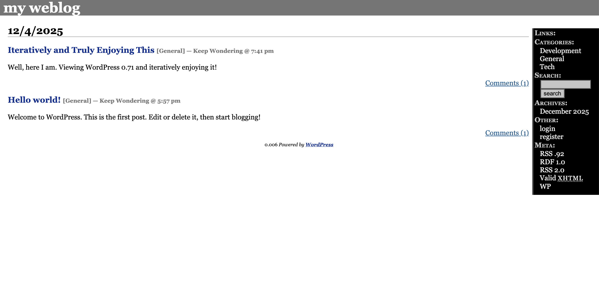
It is stark. We have a grey header, a white content area, and a jet-black sidebar. It feels very “Industrial Chic.” It’s not trying to be pretty; it’s trying to be a blog.
A few favorite details:
- The Content: You can see the classic “Hello world!” post, sitting right below my own contribution where I am obnoxiously telling the world: “Iteratively and Truly Enjoying This”.
- The Speed: Look at the footer. “0.006 Powered by WordPress”. The site generates in a fraction of a blink. Who needs caching plugins when your code is this light?
It’s simple, it’s readable, and it works. But we aren’t done digging yet.
The Comment Section: Just “Say It!”
Finally, let’s look at how people actually interacted back then.
If you scroll down to the comment form, you are greeted with some very specific instructions and one of the best buttons I have ever seen.

My favorite part is the button. Forget the “Post Comment” or “Submit” we are used to. In 2003, the button enthusiastically invites you to: “Say it!”. C’mon! Join the conversation.
Sorry I Kept You Waiting; Here Is a Full Screen Recording
We’ve walked through the screenshots, but static pixels just don’t capture the raw speed of 2003. You really have to see it running to believe it.
I’m not going to give you a long, drawn-out outro. Instead, I’m going to channel the energy of that comment form button we just looked at. I’m not going to ask you to view the video.
Watch it!
Leave a Reply